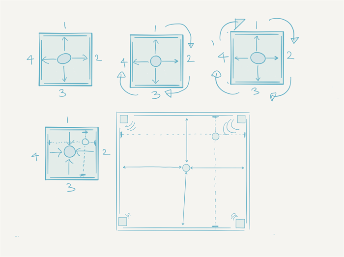
Using Paper on my new iPad Pro I worked up some notes and sketches to try and capture and develop my thinking which I’ve since reorganised and lightly edited here. I subsequently discussed key concepts – such as ‘Screen Types’ – with Andy Williams.
Envisaging the Installation
The challenge is to envisage a creative conceptual model of how a final version of the installation might look and behave based on intuition and implicit practitioner “know how” – and yet be open enough to allow the design to emerge and evolve through the user testing and analysis. Using the analogy of a moving target and gun site this is more about moving the target in response to a movement in the site than the other way around.
Imagine an installation for up-to 5 users – each controlling one sound source – each visually and sonically localised wrt to their position within the room i.e. in the centre their sound comes out equally from each speaker and at a corner from that speaker only. This is reinforced visually with speaker icons at the edge of each screen and visual representations of their sound source displayed on all four screens simultaneously as if in a crosshair – as per the representation of the physical space example above.
Gestures – e.g. pan, tilt, yaw of the ball, shaking the ball vertically and horizontally, drawing simple shapes with the ball e.g. triangles, circles, squares – are recognised by the system and control an aspect of sound – volume, cutoff, resonance, reverb etc. This ‘lexicon’ of gestures might also have a simple ‘syntax’ – chaining gestures together might create different effects.
The installation should have two modes:
- a ‘Preview’ mode where all the interactions with the interfaces are real-time and performative;
- a ‘Record’ mode where interactions once practised in the Preview mode can be recorded and looped and ordered.
Sound sources can influence one another – bring two sound sources in close proximity to each other and they modulate/affect each other in some way – as yet undefined – perhaps as frequency or amplitude modulation?
Rough Development Path
- realise an extended desktop multi-screen + quad audio infrastructure;
- prototype a simple audiovisual environment that can use this infrastructure to different effect;
- test and analyse users responses to these different screen types – initially through TouchOSC interfaces on an iPad;
- discuss ideas for interface testing with Andy – don’t have to try them all – test and analyse user responses to these different interfaces;
- develop sonic palettes;
- develop ‘literal’ visual representations of these sonic palettes;
- test a ‘proof of concept’ of these audiovisualisations then refine and develop further;
- test the Pozyx Labs development kit with a minimum of two tags;
- log data from user testing – pass on to John Stell for QRS analysis;
- document (video + photography) user testing – possibly pass on to John Stell for QSR analysis.
Inputs & Outputs
Interface inputs
- Pozyx Labs development kit – positioning + pressure + 9 degrees of freedom sensor;
- proximity sensor;
- capacitive touch.
Interface outputs
- visual feedback – BlinkM and/or Adafruit Neopixel;
- sonic feedback – Mozzi/Audio library + amp + speaker;
- haptic feedback – Fyber Labs LRA Haptic Flex Module + Samsung LRA Vibrator;
Audiovisualisation outputs
- sound palette(s) – from Andy Williams and Lewis Sykes;
- visualisations – illustrations/animations by Manchester School of Art staff;
- lighting – DMX controlled – requires new lights for multimedia space.
The Nature of the Screen
A screen can act as a:
- canvas;
- 2D/3D workspace – an abstracted version of a physical workspace such as a desktop;
- a window onto a virtual 3D world (or 2D abstraction of a 3D world);
- a mirror of the physical space.
In a wider context screens can also represent:
- data visualisation;
- broadcasting/narrowcasting dramatic or documentary content.
- a remote space – a window to a remote location and/or shared space – telematics;
Prototype a simple audiovisual environment configured so that each screen is:
- a separate space – no connection between them;
- part of an extended desktop – but no wraparound – immersive, pseudo VR environment, 360 degree video (buy 360 degree camera?);
- part of an extended desktop – with wraparound – like a 3D VR environment (or 2D abstraction of a 3D environment) with user at the centre – but room has no dimension;
- screens are mirrors of the space – room has dimension – screens represent user location within it – like a positionally adjusted cross-hair.
Ideas generated through a discussion of screen types with Andy Williams:
- 4 actors in a play – one on each screen;
- mixing what the screens are – i.e.. video alongside ‘data’ visualisations e.g. heat map;
- canvas to tell stories – what is the relationship between the four screens?;
- seeing ‘odd’ relationships between screens – something you normally wouldn’t see/experience – like a view from behind your head;
- meshes – moving/bending wireframe walls/intersections.